Archive | Exercises RSS feed for this section

The final goal: Your own homepage?

17 Jun

When looking at the result of the DPP course you of course also have to look at homepages.

I think at the stage that most of the people that take this course are a homepage is a goal. Maybe to represent you as an artist, maybe get you jobs or as a way of spreading your pictures among friends and colleagues.

I have so far done two homepages, first the stables:

www.stallabergstorp.se

And apart from the one here even

abergstorp.wordpress.com

As you can imagine was the first one the hardest. WE wanted to have a page that represented us, my wife and me, tell visitors about the things that Nina dig with horses, training, which horses are on the farm and so on.

Most important was I think to get a good structure and invest a lot of time to see what you want to show and do that in a logical, easy to understand order.

After that, at least in our case, it was to “just” fill the pages with information, again not too much but easy to understand, and pictures to make it more attractive.

Of course, one thing to think about; it has to be easy to chance and update it!


We started of with looking at different designs and went from there.

Now after having started and almost finished the DPP course I have done a page just for me and as I wanted it to be easy to maintain and easy to keep updated it became a WordPress-page.

I thought also of it as a test page before maybe getting an own page with my own www-name.

There are several good advices in the course material, which I unfortunately had not read before I did the page (page 104) so I had to think myself and fortunately I was not that far off.
Probably now, after having it online a couple of weeks, my conclusions are….less is more.

You have to reduce, reduce, reduce to the absolute perfect pictures. No other pictures should be on your page.

Yesterday I read an article about specialisation in photography. Maybe not at the stage of experience I am on right now but I think I have to keep in mind. Concentrate on the areas you are good in. Experimenting and fun in your leisure time and when wanting to show the versatility of you as a photographer but when designing a page for you as a professional photographer show less and show that you know what you are doing.

When looking at other photographers in the area I live in one could clearly see the strengths and weaknesses of the photographers and that matched the experiences of customers that I talked to that had met them. Advantage and disadvantage with living in a small city. 🙂

IMG_6853

DPP I – The final part

16 Jun

Now the day of the final part has come. Almost scary.

This part is about the finishing touches to the work one has done.

In other words: Post-post-processing.

Back-ups

Always a problem with pictures, maybe especially digital pictures, is the problem of losing them. It can be a mistake deleting them or “destroying” it by manipulating it beyond recognition and having done so on the original file and not a backup. With technique you always have the problem with computer- or hard drive-crashes.

So what should one do?

There are many possibilities, probably depending a little on how much data you collect.

Backups should in my opinion be on different media and if possible on different places.

The ranges from backup on DVD to external hard drives, cloud-services or having your own server and backing up on that one and in that case having the convenience if your house burns down your pictures are save.

Biggest problem is normally that one forgets to do it regularly and with that can be the loss bigger or smaller depending on luck.

I normally backup once a week with Lightroom and maybe once a month the pictures but that depends a little on how many and how important pictures I have taken during the last few days.

When looking at another aspect of backing up you have to consider in what format you do it. JPG? RAW? DNG? Nobody really knows if all the formats that are “readable” now will be readable in 20 years.

Printing

Printing is a science of itself I think.

Problems arise because you have to get the colours, sharpening, resolution and so on right.

Biggest problem is I guess to get the colours right because of the differences between the colours you see, you record with your camera, you see on-screen and you print.

A friend of mine, professional photographer, once said….the easiest way of dealing with that is to adjust the printer via your eye and comparing the result with the screen.

Problems here: Every ink and every paper has to get adjusted separately. I tried several times a photometer to adjust the printing and screen but it was not very satisfying. Probably because of the way I saw the object and saw the image and that the camera was not able to capture it the way I had seen it. Also different lighting situations in your office makes big differences in how the colours look.

I have come to the conclusions that you should stick to the original inks, if possible even the original paper. Otherwise, “Try and error.”

Sharpening – taken from Cambridge in Colour

16 Jun

I found two brilliant tutorials on sharpening and what happens on a pixel-base when sharpening.

Couldn’t hold myself to copy it because you understand the whole concept after you have read it.

When looking at the exercises we were asked to do it explains a lot when comparing it with the tutorials.

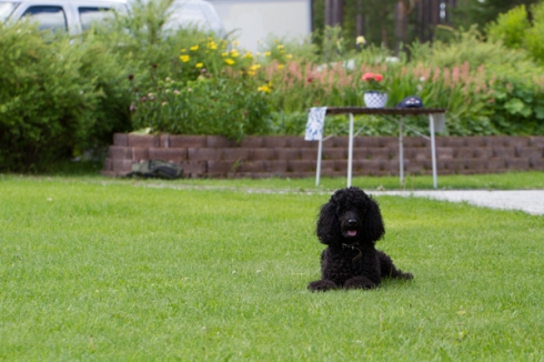
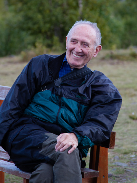
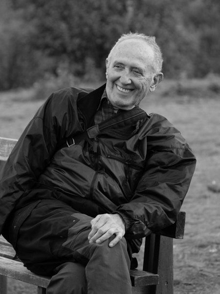
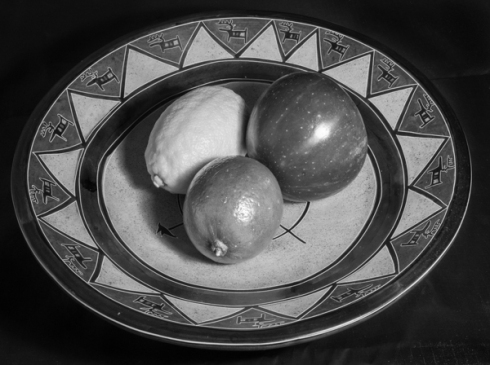
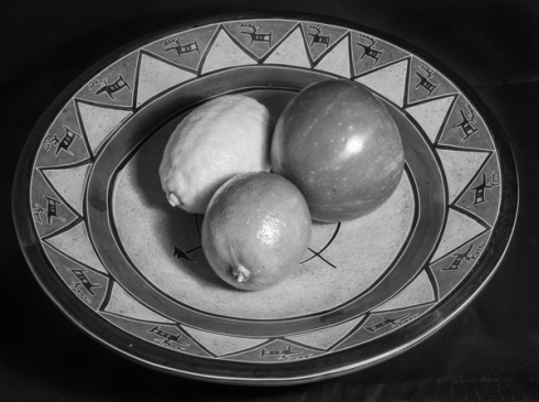
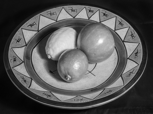
I took, as recommended, a portrait with several edges and contrast so that I could compare the different effects that sharpening at different levels had.

When looking at the screen I took the RAW-file and took the amount of sharpening from 0% to 150% in 25% steps. Other adjustments were not done such as Threshold, details, and so on. Between 50 and 75% sharpening was the level I liked the most thereafter getting halos around his hair straws. The original sharpening of 25% that is added by Lightroom was absolutely fine, maybe a little sub-optimal.
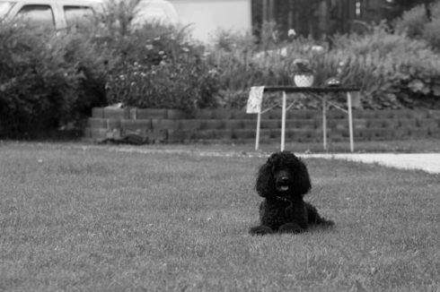
Thereafter I printed 0-125% on a A3+-ark in order to be able to compare it an easy and smooth way. There you could see that even 125% was ok to look at. My wife did not see any particular differences in the six pictures. Of course were the pictures around 12cm high, in other words not that much but even looking at it at different distances, angles and with the help of a magnifying glas did not show very many differences between the versions.

After that I read the Cambridge in Colour article and and their information now gave sense to my observations.

So in short

You have to adjust radius, amount threshold, … depending on what the image shows and the quality of it.

Depending on where to use it. maybe around 50% for screen, 100 or more for print, !!! when reducing the image size for the web you have to add a little sharpening at a radius of ca. 0,2 px.

Try and error!!!!

http://www.cambridgeincolour.com/tutorials/sharpness.htm

http://www.cambridgeincolour.com/tutorials/image-sharpening.htm

GUIDE TO IMAGE SHARPENING

Image sharpening is a powerful tool for emphasizing texture and drawing viewer focus. It’s also required of any digital photo at some point — whether you’re aware it’s been applied or not. Digital camera sensors and lenses always blur an image to some degree, for example, and this requires correction. However, not all sharpening techniques are created equal. When performed too aggressively, unsightly sharpening artifacts may appear. On the other hand, when done correctly, sharpening can often improve apparent image quality even more so than upgrading to a high-end camera lens.

Sharp Cacti

sharp cacti at the Huntington Gardens – Pasadena, California

HOW IT WORKS

Most image sharpening software tools work by applying something called an “unsharp mask,” which despite its name, actually acts to sharpen an image. Although this tool is thoroughly covered in the unsharp mask tutorial, in a nutshell it works by exaggerating the brightness difference along edges within an image:

Photo of the letter “T”
Original Sharpened

Note that while the sharpening process isn’t able to reconstruct the ideal image above, it is able to create the appearance of a more pronounced edge (see sharpness: acutance & resolution). The key to effective sharpening is walking the delicate balance between making edges appear sufficiently pronounced, while also minimizing visible under and overshoots (called “sharpening halos”).

unsharpened originalSoft Original
sharpMild Sharpening
oversharpenedOver Sharpening

note: all images shown at 200% zoom to improve visibility

SETTINGS

Fortunately, most of the sharpening settings within image-editing software are reasonably standardized. One can usually adjust at least three settings:

Setting How It Works
Radius Controls the size of the edges you wish to enhance, where a smaller radius enhances smaller-scale detail. You’ll usually want a radius setting that is comparable to the size of the smallest detail within your image.
Amount Controls the overall strength of the sharpening effect, and is usually listed as a percentage. A good starting point is often a value of 100%.
Threshold
(Masking)
Controls the minimum brightness change that will be sharpened. This can be used to sharpen more pronounced edges, while leaving more subtle edges untouched. It’s especially useful to avoid sharpening noise.
Detail
(if avail.)
Controls the relative sharpening of fine versus coarse detail (within a given radius value), in addition to affecting the overall strength of sharpening. Higher values emphasize fine detail, but also increase the overall sharpening effect. You will therefore likely need to adjust this setting in conjunction with the amount/percent setting.

It’s generally advisable to first optimize the radius setting, then to adjust the amount, and then finally to fine-tune the results by adjusting the threshold/masking setting (and potentially other settings such as “detail”). Optimal results may require a few iterations.

SHARPENING WORKFLOW

Most photographers now agree that sharpening is most effective and flexible when it’s applied more than once during image editing. Each stage of the sharpening process can be categorized as follows:

Capture Sharpening Creative Sharpening Output Sharpening
scanner Camera camera lens LCD screen Printer
Accounts for your image’s source device, along with any detail & noise characteristics Uniquely accounts for your image’s content & artistic intent Accounts for final output medium, after editing/resizing

(1) Capture sharpening aims to address any blurring caused by your image’s source, while also taking image noise and detail into consideration. With digital cameras, such blurring is caused by the camera sensor’s anti-aliasing filter and demosaicing process, in addition to your camera’s lens. Capture sharpening is required for virtually all digital images, and may be applied automatically by the camera for photos which are saved as JPEG files. It also ensures the image will respond well to subsequent rounds of sharpening.

(2) Creative sharpening is usually applied selectively, based on artistic intent and/or image content. For example, you might not want to apply additional sharpening to a smooth sky or a person’s skin, but you may want to crank up the sharpness in foliage or a person’s eye lashes, respectively. Overall though, its use may vary wildly from photo to photo, so creative sharpening is really a “catch all” category. It’s also the least used stage since it can also be the most time-consuming.

(3) Output sharpening uses settings customized for a particular output device, and is applied at the very end of the image editing workflow. This may include special considerations based the size, type and viewing distance of a print, but it can also be used to offset any softening caused by resizing an image for the web or e-mail.

Overall, the above sharpening workflow has the convenience of being able to save edited images at a near-final stage. When printing or sharing one of these images, all that is needed is a quick top-off pass of sharpening for the output device. On the other hand, if all sharpening were applied in a single step, then all image editing would have to be re-done every time you wished share/print the photo using a different output device.

Note: the above capture, creative and output sharpening terminology was formally introduced in
Real World Image Sharpening by Bruce Fraser & Jeff Schewe. Highly recommended.

STAGE 1: CAPTURE SHARPENING

Capture sharpening is usually applied during the RAW development process. This can either occur automatically in your camera, when it saves the image as a JPEG, or it can occur manually using RAW software on your computer (such as Adobe Camera RAW – ACR, Lightroom or any other RAW software that may have come with your camera).

Automatic Capture Sharpening. Although most cameras automatically apply capture sharpening for JPEG photos, the amount will depend on your camera model and any custom settings you may have applied. Also be aware that the preset shooting modes will influence the amount of capture sharpening. For example, images taken in landscape mode are usually much sharper than those taken in portrait mode. Regardless, optimal capture sharpening requires shooting using the RAW file format, and applying the sharpening manually on your computer (see below).

Manual Capture Sharpening requires weighing the advantages of enhancing detail with the disadvantages of amplifying the appearance of image noise. First, to enhance detail, sharpen using a radius value that is comparable to the size of the smallest details. For example, the two images below have vastly different levels of fine detail, so their sharpening strategies will also need to differ:

photo with coarse detailCoarse (Low Frequency) Detail
Sharpening Radius: 0.8 pixels
photo with fine detailFine (High Frequency) Detail
Sharpening Radius: 0.4 pixels

Note: The sharpening radii described above are applied to the full resolution images
(and not to the downsized images shown above).

Shooting technique and/or the quality of your camera lens can also impact the necessary sharpening radius. Generally, well-focused images will require a sharpening radius of 1.0 or less, while slightly out of focus images may require a sharpening radius of 1.0 or greater. Regardless, capture sharpening rarely needs a radius greater than 2.0 pixels.

original soft photoSoft Original
sharpening radius too smallRadius Too Small
(0.2 pixels)
sharpening radius too largeRadius Too Large
(2.0 pixels)
optimal sharpening radiusRadius Just Right
(1.0 pixels)

When trying to identify an optimum sharpening radius, make sure to view a representative region within your image that contains the focal point and/or fine detail, and view it at 100% on-screen. Keep an eye on regions with high contrast edges, since these are also more susceptible to visible halo artifacts. Don’t fret over trying to get the radius “accurate” within 0.1 pixels; there’s an element of subjectivity to this process, and such small differences wouldn’t be distinguishable in a print.

When noise is pronounced, capture sharpening isn’t always able to be applied as aggressively and uniformly as desired. One often has to sacrifice sharpening some of the really subtle detail in exchange for not amplifying noise in otherwise smooth regions of the image. Using high values of the threshold or masking settings help ensure that sharpening is only applied to pronounced edges:

Without sharpening threshold/masking:
With sharpening threshold/masking:
Original Image Sharpening Mask Move your mouse over above images
to see the unsharpened original.

The value used for the “masking” setting used above was 25.

Note how the masking/threshold setting was chosen so that only the edges of the cactus leaves are sharpened (corresponding to the white portions of the sharpening mask above). Such a mask was chosen because it doesn’t worsen the appearance of image noise within the otherwise textureless areas of the image. Also note how image noise is more pronounced within the darker regions.

If image noise is particularly problematic, such as with darker tones and/or high ISO speeds, one might consider using a creative sharpening technique, or using a third-party noise reduction plug-in. At the time of this writing, common plug-ins include Neat Image, Noise Ninja, Grain Surgery & Noiseware. However, noise reduction should always be performed before sharpening, since sharpening will make noise removal less effective. One may therefore need to postpone sharpening during RAW development until noise reduction has been applied.

STAGE 2: CREATIVE SHARPENING

While creative sharpening can be thought of as just about any sharpening which is performed between capture and output sharpening, its most common use is to selectively sharpen regions of a photograph. This can be done to avoid amplifying image noise within smooth areas of a photo, or to draw viewer attention to specific subjects. For example, with portraits one may want to sharpen an eye lash without also roughening the texture of skin, or with landscapes, to sharpen the foliage without also roughening the sky.

The key to performing such selective sharpening is the creation of a mask, which is just a way of specifying where and by how much the creative sharpening should be applied. Unlike with the output sharpening example, this mask may need to be manually created. An example of using a mask for creative sharpening is shown below:


Sharpening Mask:
Image Used for Creative Sharpening
Move your mouse over the image to see
selective blurring applied to background
Selective Sharpening Using a MaskTop layer has creative sharpening applied; mask ensures this is only applied to the white regions.

To apply selective sharpening using a mask:

  1. Sharpen Duplicate. Make a duplicate of your image (with capture sharpening and all other editing applied), then apply creative sharpening to the entire image. This sharpening can be very aggressive since you can always fine-tune it later.
  2. Create Mask. In Photoshop, use the menus Layer > New > Layer…, or the Shift+Ctrl+N keys.
  3. Paint Mask. Select the layer mask (by left-clicking on it). Paint regions of the image with white and/or black when you want creative sharpening to remain visible or hidden in the final image, respectively. Shades of gray will act partially.
  4. Fine-Tune. Reduce the opacity of the top layer if you want to lessen the influence of creative sharpening. You can also change the blending mode of this layer to “Luminosity” to reduce color artifacts.

Alternatively, sometimes the best technique for selectively sharpening a subject is to just blur everything else. The relative sharpness difference will increase — making the subject appear much sharper — while also avoiding over-sharpening. It can also lessen the impact of a distracting background. Move your mouse over the top left image to see this technique applied to the previous example.

Another way of achieving the same results is to use a brush, such as a history, “sharpen more” or blurring brush. This can often be simpler than dealing with layers and masks. Sometimes this type of creative sharpening can even be applied along with RAW development by using an adjustment brush in ACR or Lightroom, amongst others.

Overall, the options for creative sharpening are virtually limitless. Some photographers also apply local contrast enhancement (aka “clarity” in Photoshop) during this stage, although one could argue that this technique falls into a different category altogether (even though it still uses the unsharp mask tool).

STAGE 3: OUTPUT SHARPENING FOR A PRINT

After capture and creative sharpening, an image should look nice and sharp on-screen. However, this usually isn’t enough to produce a sharp print. The image may have also been softened due to digital photo enlargement. Output sharpening therefore often requires a big leap of faith, since it’s nearly impossible to judge whether an image is appropriately sharpened for a given print just by viewing it on your computer screen. In fact, effective output sharpening often makes an on-screen image look harsh or brittle:

Original Image Output Sharpening Applied
for On-Screen Display
Output Sharpening Applied
for a 300 PPI Glossy Print

Photograph of the Duomo at dusk – Florence, Italy (f/11.0 for 8.0 sec at 150 mm and ISO 200)

Output sharpening therefore relies on rule of thumb estimates for the amount/radius based on the (i) size and viewing distance of the print, (ii) resolution of the print (in DPI/PPI), (iii) type of printer and (iv) type of paper. Such estimates are often built into RAW development or image editing software, but these usually assume that the image has already had capture sharpening applied (i.e., it looks sharp when viewed on-screen).

Alternatively, one can also estimate the radius manually using the calculator below:

Viewing Distance*

 default: 25 cm 10 cm 50 cm 1 m 5 m 10 m 100 m 500 m default: 25 cm

Print ResolutionPPI**

Estimated Sharpening Radius

**PPI = pixels per inch; see tutorial on “Digital Camera Pixels.” DPI is often used interchangeably with PPI, although strictly speaking, the two terms can have different meanings.
*It’s generally a good estimate to assume that people will be viewing a print at a distance which is roughly equal to the distance along the print’s diagonal.

The above radius estimates should only be taken as a rough guideline. In general, a larger viewing distance demands a larger output sharpening radius. The key is to have this radius small enough that it is near the limit of what our eyes can resolve (at the expected viewing distance), but is also large enough that it visibly improves sharpness.

Regardless, the necessary amount of sharpening will still likely depend on the image content, type of paper, printer type and the look you want to achieve. For example, matte/canvas papers often require more aggressive sharpening than glossy paper. A good starting point is always the default amount/percent value used by your image editing software. However, for mission-critical prints this best solution is often just trial and error. To save costs, you can always print a cropped sample instead of the full print.

STAGE 3: OUTPUT SHARPENING FOR THE WEB & EMAIL

Even if an image already looks sharp when viewed on-screen, resizing it to less than 50% of its original size often removes any existing sharpening halos. One usually needs to apply output sharpening to offset this effect:

Original Image Softer Downsized Image
Downsized Image
(after output sharpening)

Move your mouse over the buttons on the right to see the effect of output sharpening.

For downsized images, an unsharp mask radius of 0.2-0.3 and an amount of 200-400% works almost universally well. With such a small radius value, one doesn’t have to worry about halo artifacts, although new problems such as aliasing/pixelation and moiré may become apparent if the amount/percent is set too high.

For more on image downsizing, see the tutorial on image resizing for the web and e-mail.

ADDITIONAL SHARPENING ADVICE

  • Sharpening is irreversible; also save unsharpened originals whenever possible.
  • RAW & TIFF files respond much better to sharpening than JPEG files, since the former preserve more detail. Further, sharpening may amplify JPEG compression artifacts.
  • Blurring due to subject motion or some types of camera shake may require advanced techniques such as deconvolution or Photoshop’s “smart sharpen” tool.
  • Some camera lenses do not blur objects equally in all directions (see tutorial on camera lens quality – astigmatisms). This type of blur tends to increase further from the center of the image, and may be in a direction which is either (i) away from the image’s center or (ii) perpendicular to that direction. This can be extremely difficult to remove, and usually requires creative sharpening.
  • Images will often appear sharper if you also remove chromatic aberrations during RAW development. This option can be found under the “lens corrections” menu in Adobe Camera RAW, although most recent photo editing software offers a similar feature.
  • Grossly over-sharpened images can sometimes be partially recovered in Photoshop by (i) duplicating the layer, (ii) applying a gaussian blur of 0.2-0.5 pixels to this layer 2-5 times, (iii) setting the blending mode of this top layer to “darken” and (iv) potentially decreasing the layer’s opacity to reduce the effect.
  • The light sharpening halos are often more objectionable than the dark ones; advanced sharpening techniques sometimes get away with more aggressive sharpening by reducing the prominence of the former.
  • Don’t get too caught up with scrutinizing all the fine detail. Better photos (and more fun) can usually be achieved if this time is spent elsewhere.

RECOMMENDED READING

If you’re thirsting for additional examples, along with a more thorough technical treatment of the above topics, a great book is Real World Image Sharpening (2nd Edition) by Bruce Fraser & Jeff Schewe.

Want to learn more? Discuss this and other articles in our digital photography forums.

Way to assignment 4 for DPP

5 Jun

My tutor recommended to show the thoughts I had on my way to assignment number four of the digital photographic practice.

The assignment was to create a cover for a newspaper, magazine or book and use different techniques to alter the picture.

Finding a suitable cover-idea was very hard and at the beginning I thought about a criminal novel with a main character lighting a cigarette while leaning against the wall.

As one can see was my wife again the stand-in-model for the testing armed with a hat to give a little Humphrey Bogart feel.

I don’t really know why I left this idea but went on to maybe just use pictures from the net and showing e.g. an aquarium through a window, that would have meant using the windowframe and use the picture from the sea in a layer below to give the impression of looking right into the sea.

The result was not what I wanted to come to.

Next were two ideas I had about a corridor in our house.

The first one showing a person standing in backlighting with swords or pistols in hand, taking the idea from the cyberpunk-movement. The corridor would have been altered in a way to look like a tunnel or just a gradient from gray to black. Neither the figure or my photoshopskills were somewhere near what was needed to get a satisfactory outcome.

After that, still in the corridor but inspired by all the “ghosthunter” series on tv I thought about having a person going through a corridor and “into the light”. That worked quite well as the test shots show but then my final idea hit me and I went with that.

Final image

Final image

Manipulating pictures – Part four of DPP, reality and invention

22 Apr

As you have seen in the last post the theme is about picture manipulation and ethics around that.

There are a few exercises to show what is possible and what kind of thoughts we have about that level of intervention with the pictures.

I thought about giving a cross section of all the exercises to get a more complete view of it.

In the course material you have several levels of alteration

  • Correction: E.g. lensflare or dust on the sensor
  • Improvement or interpretation: Taking e.g. the face of a person and giving more attention to the eyes
  • Enhancement: Changing flaws in the face, e.g., missing teeth, birth marks and so on
  • Addition: For instance getting a better sky from another picture in order to get a more pleasing landscape shot., HDR
  • Alteration: Taking away things or putting them into the picture.

The first example is one where I took away some dust that was on the sensor and lens flare in the second example. Those were downloaded from the OCA key resources.  In my opinion absolut ok to make those improvements or better said corrections that come with the light or the new technologies that are vulnerable to dust.

exercise-19-dust-shadows1

exercise-19-dust-shadows

exercise-19-flare

exercise-19-flare Kopie

Down here some pictures I did some “general” editing on, in my opinion absolutely fine, in order to get the best out of the pictures as you cannot get it directly from the camera.

original

original

black and white with more spectacular sky

black and white with more spectacular sky

original

original

Same day just traditional "darkroom" editing

Same day just traditional “darkroom” editing

black and white version

black and white version, edited in SilverEfex Pro

Now improvement of a portrait, headshot, in the first three pictures just general improvements of contrast and the like. The last two pictures on the other hand have improvement of the eyes with increased brightness and saturation. I my opinion already too much manipulation as the eyes look not natural to this person.

original

original

first edition, which I had done before I even knew about the assignment

first edition, which I had done before I even knew about the assignment

Pulling a little more on the levers and getting more contrast, clarity into the face without getting "strange"

Pulling a little more on the levers and getting more contrast, clarity into the face without getting “strange”

Editing of just the eyes, lightening the sclera and iris with the standard ""improve iris" in Lightroom

Editing of just the eyes, lightening the sclera and iris with the standard “”improve iris” in Lightroom

More to my taste with darker pupil which gives a more natural look I think.

More to my taste with darker pupil which gives a more natural look I think.

Now two pictures in one where I took the sky from one and the landscape from another one.

Two-in-one, sky of the third picture and landscape of the second one. Edited in Photoshop with layers to improve the exposure of the landscape and layers with layermask to get the sky where it belongs. Not used to Photoshop-work, therefore slight problems with the border of sky to the trees.

Two-in-one, sky of the third picture and landscape of the second one. Edited in Photoshop with layers to improve the exposure of the landscape and layers with layermask to get the sky where it belongs. Not used to Photoshop-work, therefore slight problems with the border of sky to the trees.

Landscape part

Landscape part

sky-part taken from the right hand side of the picture

sky-part taken from the right hand side of the picture

More editing in Lightroom, mostly traditional darkroom work.

right from the camera

right from the camera

ND-filter from lightroom to get the sky darker while getting the landscape lighter, especially the road

ND-filter from lightroom to get the sky darker while getting the landscape lighter, especially the road

directly from the camera

directly from the camera

Focus on my father with vignette, some more saturation and increased brightness of him

Focus on my father with vignette, some more saturation and increased brightness of him

Some more editing possibilities. HDR, polarizing filter and two-in-one-picture again

HDR version of a RAW-file that I "exposed" in five different ways and set together in Luminance HDR

HDR version of a RAW-file that I “exposed” in five different ways and set together in Luminance HDR

Fake ND with help of a polarizing filter.

Fake ND with help of a polarizing filter.

Two in one again. Two versions of the same picture. One exposed for the sky and the other for the landscape. Combined in Photoshop.

Two in one again. Two versions of the same picture. One exposed for the sky and the other for the landscape. Combined in Photoshop.

dfsf

With and...

With and…

without ventilation. Mixture of the clone and healing tools in photoshop but even copying of a larger bit of wood from the right hand side and setting it over the ventilation and doing some transformation to make it fit.

without ventilation.
Mixture of the clone and healing tools in photoshop but even copying of a larger bit of wood from the right hand side and setting it over the ventilation and doing some transformation to make it fit.

Photography and manipulation

18 Apr

Now the fourth part of the DPP 1 course.

Photography and manipulation, what is o.k. and what is too much?

When looking at  fashion or make-up photography you of course begin to ask yourself…”does she really look that good?” How much Photoshop was used? and when after that looking at videos on youtube about extreme-make-over of a model you really begin to doubt that photography and reality has something to do with each other, especially when thinking about what people thought about photography earlier: “There is a photography, it must be real!”

In my opinion you have to differentiate about what kind of photography you are dealing with and what you are told about the situation.

Changes of the picture like taking away dust or lensflare is ok as long as you don’t change the picture.

HDR is ok because the cameras do not have the dynamic range of the eye and not the capability to change the exposure as we do when scanning a scenery of strong contrasts. When taking HDR so far that you get a psychedelic feeling about the picture it is of course not o.k., unless you want to convey that feeling and tell it for the visitor or have it in a series of “psychedelic” photos that the beholder knows that.

In the course material we even got was a median-filter mentioned and even that is ok under the right circumstances. For example a picture in a book about architecture i think it would be absolutely ok to use that filter because the building is the interesting thing and not the context as a tourist attraction for instance.

I mean when looking at photography you even have to look at computer aided design and when looking at an IKEA catalogue you must remember that almost all pictures in it are done in the computer but look like a photography.

What about the other way round? David LaChapelle´s pictures look photoshopped to the maximum…men all the pictures are “real”.

The last few months and years the discussion about altering faces and bodies in advertisements and with that giving a wrong picture of the female body, setting extreme stress on girls that want to look exactly like the ones in the ads but cannot…simply because of Photoshop. as far as I remember has France begun with some kind of control of the pictures before they get published, just to avoid those “über-females” that cannot be reached and are not real.

Documentary photography like war photography e.g. are forbidden to alter. Dust, maybe lensflare and the “normal” changes in contrast and exposure, … are o.k as long as they do not change the content of the picture. There is of course a fine line between what is realistic and what is an interpretation of the photographer. White balance e.g. making the whole picture colder or warmer, conveying a feeling to the beholder.
When looking at the case of the photographer that added some smoke-clouds over Tripolis a few years ago…that is absolutely unacceptable. If he had done that and said: “This is how i saw it, I edited it in order to get feeling better across” that would have been ok, but not to sell it in as the truth.

Looking at another case you should look at Terje Hellsoe that lost a lot of his reputation of one of the best nature photographers of scandinavia when he got caught with an edited picture. He had added a lynx to a picture and said that he had taken the picture out in the wild. Worse it was not even in a cage or a photo that he had taken but he took the lynx from another picture and photoshopped it in. One of his explanations was that the pressure of delivering better and better pictures all the time just got too strong and he went that “shortcut”. Understandable but not really acceptable.

Looking at his work you can see that it was a big mistake and that he is just one of the best that happened to make a wrong decision. http://terjehelleso.se/

Enjoy!

Colours into tones 2

11 Dec

This exercise is about putting the new conversion techniques and knowledge to the test by taking a picture and adjusting it as we are asked to.

We could choose between emphasising the haze in a landscape image, lightening the complexion in a portrait or having a garden pictures with light green tones.

I chose to take the second and third task.

First of is the garden picture showing the colour version, then the automatic conversion, then the conversion without adjustments and finally my version.

colour

colour

automatic conversion

automatic conversion

Conversion without adjustments

Conversion without adjustments

My version with just light greens tones.

My version with just light greens tones.

Now the second task comes with converting a portrait picture into b&w, and lightening the complexion without altering the other tones. That proved to be a little harder as the skin tones were also in the bushes behind my subject so that I had to darken that a little by decreasing the orange tone.

Colour

Colour

automatic conversion

automatic conversion

My version with lightened complexion.

My version with lightened complexion.

Colours into tones 1

11 Dec

This exercise is about converting images that have strongly contrasting colours in them into b&w and increasing the luminance of one colour while decreasing the second and then vice versa.

I chose for that a still life made with fruits and chose green respectively red as my contrasting colours.

The fist picture showing the colour version. Nice is it that you even can see several other colours and how adjusting red or green alters them.

Original

Original

The first b&w version is the one with automatic conversion using Lightroom. Very strong colours, distinct difference between the lighter yellow, reds slightly darker than the green lime.

automatic b&w

automatic b&w

This version has an increase for the greens and decrease for the reds. Adjustment was all the way up or down to better see the differences. Interesting to see is the plate which changes character completly, like a negative version when comparing it with the version below it. Blues and oranges were not altered, or at least not in a significant way. The lighter blue stripe depends upon that I converted it to b&w and took away the automatic adjustment.

Green

Green

This is the opposite version from the image above. Specially the plate is impressively different. And of cour seeing that the apple changes from almost complete black to complete white shows that this colour was quite “pure”, while the lime was not quite white or black, meaning that the green is not a pure green but has other colours in it.

Red

Red


Down here are two versions I did in b&w of the picture. Mainly the difference between green and red got adjusted. That to my eyes looks more realistic than the automatic conversion but not as artistic.

version 1

version 1

version 2

version 2

Strength of interpretation

10 Dec

When comparing b&w and colour images you also have to take into consideration how much you can alter them before they look strange or unpleasant.

We were asked to take two images and alter contrast respective do a high-key or low-key treatment. I did some more pictures then shown here and I think when looking at how much you can increase exposure before it looks unusable my impression was that it differed from half a stop to about two step that you can increase more in b&w. Looking at the opposite part of the scale, decreasing exposure the difference was not that much, about 1/3 to 1/2 of a stop difference in favour of the b&w image. I think that it depends upon that the darker a coloured picture gets the stronger and more saturated the colour become and in most conditions pleasing while the b&w version just gets darker into black, of course depending on the colour scale in the frame.

When looking at contrast adjustments there was a huge difference in increasing contrast but not that much in decreasing it. This time it got too surrealistic for my taste. To see how it was with decreased contrast I added them below here.

Interesting was to see how the colour translated to tones of grey. Difficult to predict it in my level of expertise but getting better at that. To have at least basic knowledge about colour and colour relations helps to predict that e.g. red in front of green looks very much alike.

Black and White

10 Dec

Why would you want to get rid of an essential part of information by converting it from colour to black and white (b/w)? I think you have to look at it from a historical point of view. Before you had the choice between colour or b/w photography there was only b/w if you ignore the fact that pinhole-“cameras” are thought to have been used when painting landscapes.

As it is described in the coursematerial b/w photography was understood to be an “interpretation of a scene into a very specific medium, dominated by tones.” Colourphotography on the other hand believes more to be “capturing reality in two dimensions”.

The advantage with b/w photography is that there is no colour that can distract the beholders eyes and leaves the composition, geometrical forms and textures speaking for itself in a stronger language.
Well used in documentary photography to have more focus on the subject. Maybe used in architectural photography when taking images where the shape is the interesting thing. Abstract images, sure.
The classic use is I guess even portrait photography where the absence of colour stresses even more the features and expression of the subject.

In our course material for DPP on page 71 is a valuable comparison between creative concern in colour and b/w photography.

BW

  • Contrast
  • Key (brightness)
  • Geometry
  • Volume
  • Texture
  • Colour into tone

Colour

  • Colour effect of exposure
  • Colour style
  • Colour relationshsip
  • Colour intensity

The pictures down here were taken in Northern Scandinavia. The first during a reindeerseparation and the second while visiting the North Cape.

When taking the pictures I thought that they would make very nice b/w images.  Sky with clouds, strong colours and the combination with clear geometrical forms such as the houses and the fact that they are old made me think of black and white conversion.

This first picture was framed according to the rule of thirds, horizon being in the lower third as the sky was beautiful with nice clouds. I had no special thoughts about the exposure but did quite a bit of editing using the black&white mixing tool in Lightroom. My thoughts were to darken the sky, leaving the clouds white/ light grey. The house became a bit lighter, raising luminance for the reds. At the same time some darkening of the green/brown colours to get more contrast between the house and ground whereupon it stands.

IMG_9177

The next picture is taken in Northern Norway and we stopped to take pictures of drying cod and just a few meters away was this nice cottage.

Framing again according to the rule of thirds and the geometrical figures found here are the horizon, the lines of the house leading the view into the frame and of course the triangle of the roof.

Main work was done again with the b&w mixing tool, raising the contrast in the sky and changing from a beautiful and sunny day to a bit more stormy feeling to it. The house was not as seperated from its backgroudn as I wanted to be and that was fixed with help of b&w mixing and dodging.

IMG_1112

This last picture shows another genre of photos, abstract nature photography. It was a sunny day and we were in a forest on an island in the local archipelago. I liked the colours and the drops on the leaves but when I got home it did not match the association and feelings I had for the plant. The thought struck me to try b&w as the picture was abstract, with clear lines and diagonals as well as dots/circles to make it interesting.

The editing was the conversion into b&w, increasing contrast and decreasing exposure. That way the drops stood out a bit to break the structure of diagonals.

IMG_8133