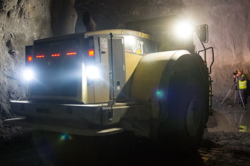
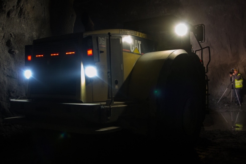
http://www.youtube.com/watch?v=RjAHkAW8pV4&feature=player_embedded#t=480
Archive | People & Place RSS feed for this section


People and place: Assignment 4 – A sense of place
13 JunHere comes the fourth assignment of the People and Place course.
It is about Gammelstad, part of the World culture heritage
People and place – assignment 4

Part four: People interacting with places
9 JunPart four is divided in several projects as you can see below.
- Busy place, quiet place
- People unrecognizable
- A matter of balance
- Special processing
In part three where primarily the places were of interest and people secondary this part is about the interactions between people and place and not to forget how people can change the picture and the feeling it conveys.
1.
First is the busy and quiet place, in other words many and few people in the frame.
To find quiet places in Norrbotten is very simple and I took a few different pictures from different places and different seasons.
What I thought was important to take into consideration was the placement in the frame but even the size and the colour in relation to the surroundings. As written in the course material there has to be a sufficient contrast to give the beholder chance to see the figure in the frame.

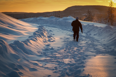
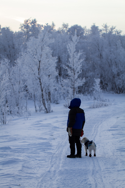
Lone figure on the way to the top. Winter picture with my mother taking a walk. Positioned in the rule of thirds. the road leading the eye to the person and where she is going.

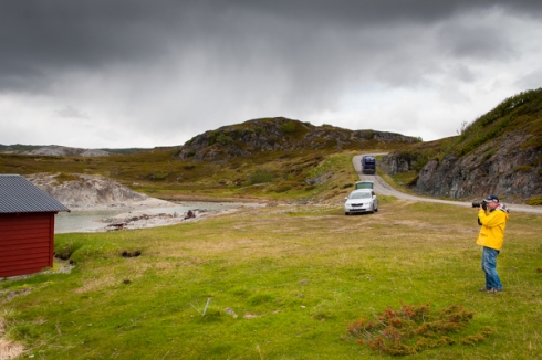
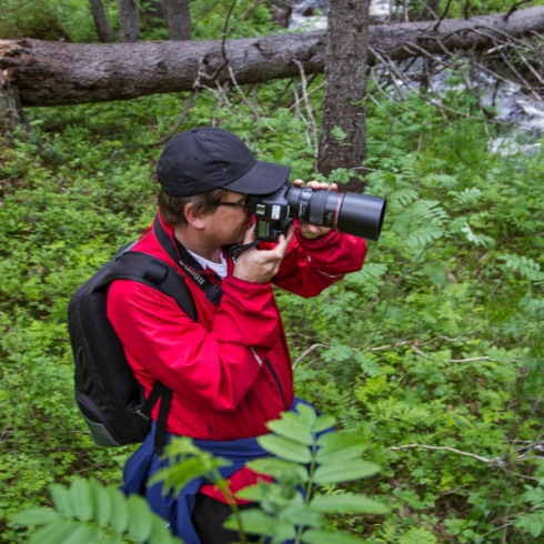
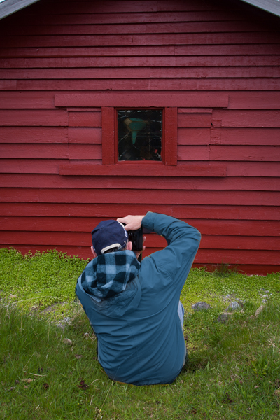
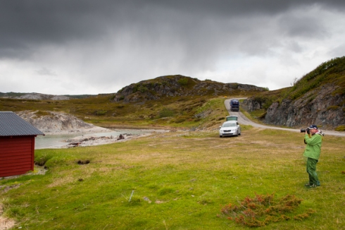
Landscape in Norway with lonely photographer. The car, the shed and the person creatng a triangle, yellow balancing the red of the shed despite him being smaller than the shed.Very close to the edge but both stance and as everyone can see what the person is doing is giving a tension and interest to the picture.

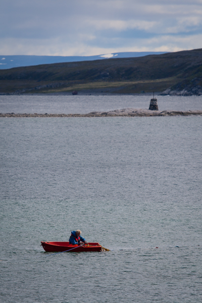
Lonely fisherman in norway checking the nets. Beinf close to the edge and sitting in a red boat in contrast to the blue surroundings, almost monochrome. Balancing it up I think quite well. I maybe should have dodged him a little to balance even better?

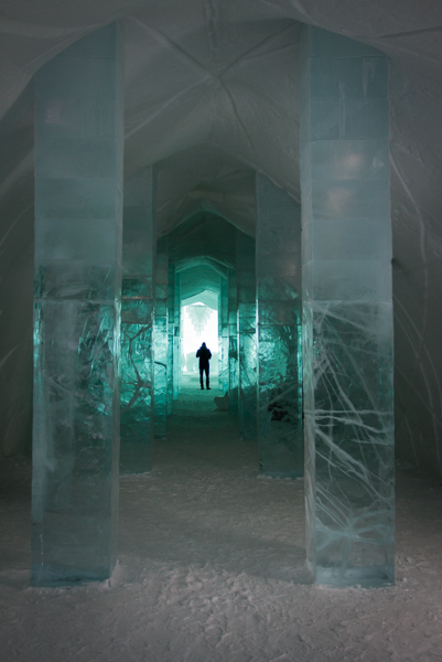
Main hall of the Ice Hotel. In the distance a single person, very small but contrasting against the white background and the pillars leading the view towards him. Symmetry was here one main goal.

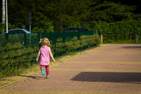
Child running to the playground and with the pink shirt having complementary colours to the hedge. Positioned according to the rule of thirds. Maybe a little to close in order to give the impression of an empty place with a single person in it.
Here now the “busy” pictures. That is quite difficult upp here if not having summer as most people go into some kind of social hibernation during the winter. There fore a mixture of pictures of 2012 and 2013.
I have tried several approaches to have the camera in the crowd, a little lower that one get the impressions being part of it but I could not really make a small crowd look big, maybe a little bigger but not that much.

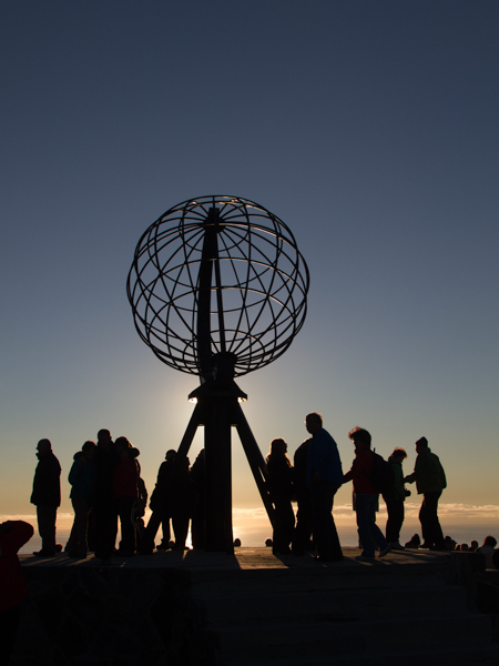
North cape with midsummer sun in the background giving both a nice backklit silhouettepictreu and with the people around it a feeling for the amount of people being there despite being eleven o’clock at night.

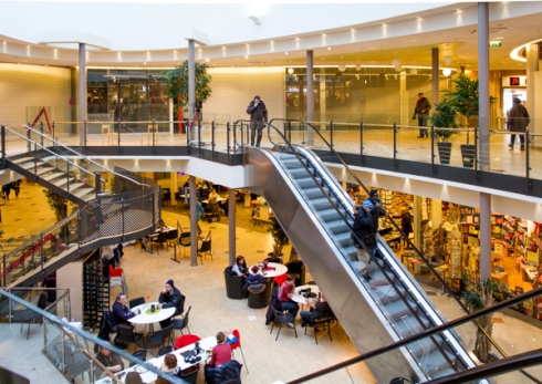
Mall as known from the third assignment.


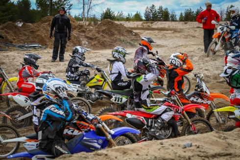
Briefing at a trainingsday of Motocross. The load of drivers making a nice crowd which with the colours give an even more mixed picture and looks “biger, more crowded” than it is.

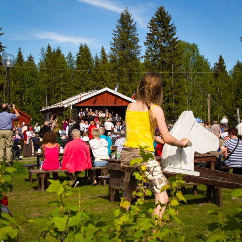
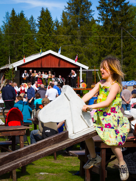
First of two pictures of this girl on a rocker with people in the background listening to music and looking at the group of people dancing traditional dances. Main focus id on the girl but the crowd gives some context, and the girl in this picture is also listening to the music which is a nice touch. The other girl is enjoying the ride conveying the feeling of the moment and event


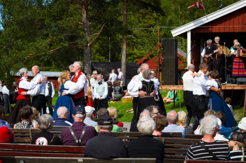
Traditional dancing with people sitting and listening.
2.
People unrecognizable
I really enjoyed that part of the exercises as the was no stop for fantasy but I even saw that I had some “standard” angles and viewpoints but that there were several other ways of making people unrecognizable.
In the course material were several approaches mentioned. All of them aiming at reducing the visual attention that the face normally gets.
- Small and many
- Facing away
- In silhouette
- Partly obscured
- Motion blur
I tried to get those points and vary them a little.

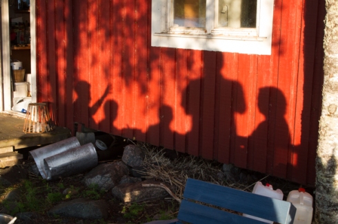
Just showing the shadows.

Not really unrecognizable but the distortion of the window makes it not so easy to recognize the person. In combination with him maybe facing slightly away would have been more effective.

Helmets on – unrecognizable

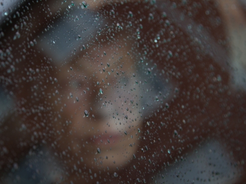
Through a car window with raindrops on it focus on them giving a slightly blurred version of the persons face. In that case my mother who said that she never had a nicer portrait taken of her. And that was the truth she said!

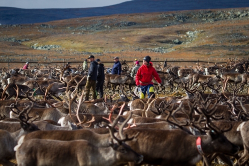
Small figure amongst reindeer. Her having a red jacket does not help but when only looking at the people in the background the eyes are not particularly drawn to them as they are a small details in the whole picture.

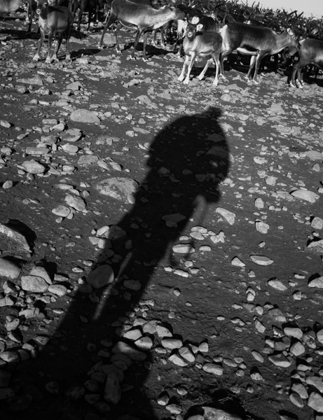
shadow again, this time a “selfportrait”

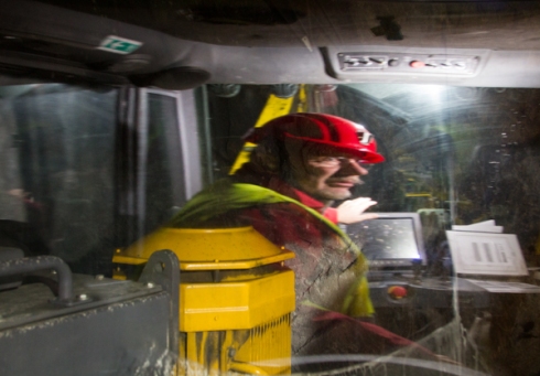
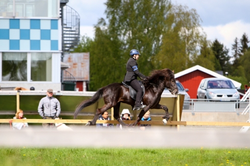
Helmet, only small figure and attention mostly on the horse and leg-action. background unfortunately crowded but because of the light there were not really alternatives.

People amongst cars, a little like the reindeer shot but even less attention on the people due to the colour of their clothing

Partly obscured by a camera.
Photographers nightmare…being photographed.

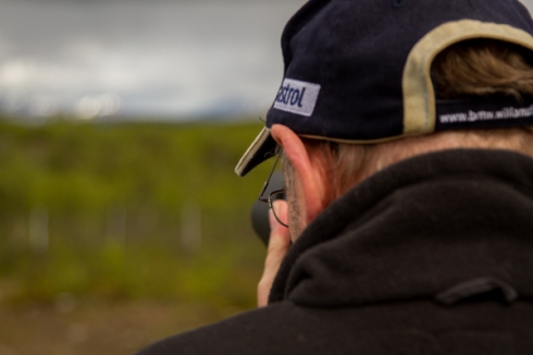
Neil, my mentor, from behind with a camera which just shows what the person is doing but not whom. Does not show much of the place though but there are other

Silhouette

3.
A matter of balance
A difficult one I thought as one has several alternatives such as size of the figure, contrast and colour-contrast but very difficult to plan.
Here are my attempts at that. The pictures in the coursematerial showed two pictures where the one balanced to the place is almost monochrome with clear rhythm of lights on the wall and one backlighting the person in the picture going out of the frame, facing away, while the other one gts light on him, black dress in front of a lighter background, light on hmi and doing something interesting or at least strange when looking at the location and with that creating the question what he is doing there, and more.

Original picture with a yellow jacket contrasting both the red and green

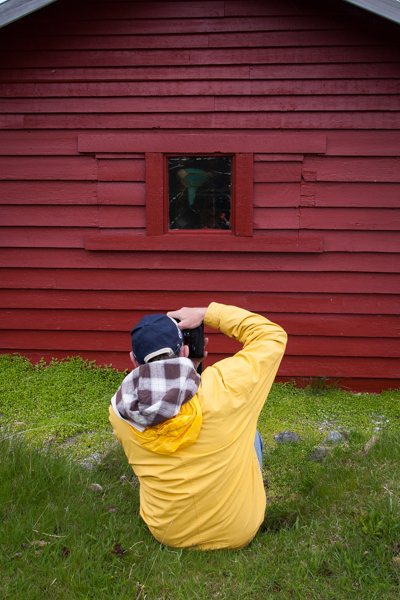
Blue jacket (Photoshop) and by having a darker colour not pulling the eyes towards it.
First of two pictures of this girl on a rocker with people in the background listening to music and looking at the group of people dancing traditional dances. Main focus id on the girl but the crowd gives some context, and the girl in this picture is also listening to the music which is a nice touch. The other girl is enjoying the ride conveying the feeling of the moment and event
looking into the frame and almost into the camera creates more interest than the other girl

Green photographer, almost camouflage against the green background.
Landscape in Norway with lonely photographer. The car, the shed and the person creating a triangle, yellow balancing the red of the shed despite him being smaller than the shed.Very close to the edge but both stance and as everyone can see what the person is doing is giving a tension and interest to the picture.
4.
Special processing
Again a very interesting exercise even thinking about the fourth part of the DPP course where discussion was around the ethics of manipulation.
There was e.g. the picture of my father sitting on a bench and by adjusting colour, contrast and with help of dodge and burn get more focus on him.
Normal procedures that can be used are vignettes, dodging/burning, lighteing up the figure and giving more contrast to the background. Cropping to give less or more space in the frame. Including or excluding things that might draw attention from the person, e.g. lightsources, colourful things, and so on.

Everything light and at least to my eyes first at the second glance the photographer catches the eye.

Darker with just distinct light sources and the photographer and mirror image on the water being dodged and by that getting a bigger place in the frame.
Motocross, the way to photograph people?
6 MayAs I have begun with the next part of the People and place course, this time about photograrphing people without being able to identify them one of the things I did was combine two things.
The course and something I wanted to do a long time….action-photography. The helmets make a wonderful way of not being able to recognize them! 🙂
We live close to a motocross-track and every weekend during the summer months we get bothered with the noise. So why not join them if you cannot beat them?
Here some pictures I took today.
Hope you enjoy them as much as I enjoyed to take them!
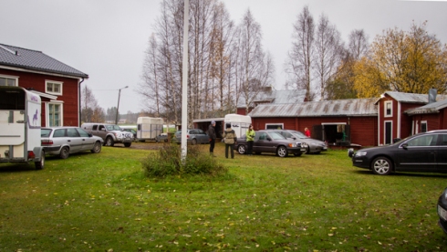
People and place: Assignment 3 – Buildings in use
30 MarHere now my third assignment in this course.
Sorry for being so slow! Winter is the worst time of the year!
Kill your idols….is that OK or just a sign of not understanding?
15 MarI have the last few weeks after looking through a lot of photographic books started to think:
“Is it ok to not like one of the photographers despite everybody else praising them to the sky?”
At first I looked at a book about Edward Weston and then also his book “Nudes”. After that came Martins Parrs “Thinking of england”, then Henri Cartier-Bressons “Europeans” and Irving Penns “Still life”.
My first impression of Edward Westons work can be found in an earlier post and I still have to admire him for exploring photography with the possibilities that he had and especially when looking at the “values” that society and certainly art had. What had been done what was “ok” to do and not to do. But of all his pictures just a handful are
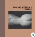
strong enough to have this “I would have liked to have taken that picture myself”-effect. One is of course the beautifully lit clams or some of his nudes.
From those books my journey went on to Martin Parr and I was shocked at first glance…..all those bubble-gum colours, not a single correctly focused picture, I apologize for my generalisation.
But looking through the book, leaving it lying around for a few days, picking it up and looking again it grow. I still would claim that if you take one of his pictures and show it to someone not familiar with art or the artist the person would not see him as one of Englands greatest photographers.
BUT, when looking at the book in his entirety you can not do anything else than admire him for his work. Not the single picture is brilliant but all of them are when looked at as a collection. Or are the pictures great and I am not understanding it? He probably chose the way he presented the pictures and subjects deliberately.
Maybe the view he has of England is so colourful that it is tasteless?
From my view as a European with both German and Catalan blood in me I found several of my prejudices confirmed regarding the “English soul” and the way of living. Maybe that was his intention?
While reading his book I also began looking through Cartier-Bressons book  about the Europeans and that finally push the question on….is it ok to not like an artist? When looking at his picture I did not find a single picture that I did not like. Technically, artistically and the whole collection of pictures are just brilliant. Maybe boring some can say? Not to me. He managed to capture the spirit and the feeling of each country with just a few pictures and with an intimacy that is not found often in photographers work. Steve McCurry might be one that also manages to get so close to the people.
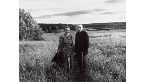
Sune Jonsson
taken from homepage of Moderna museet in Stockholm.
Living in Sweden I think of course of Sune Jonssons book “Byn med det blå huset” (Village with the blue house) where he travels to the remote parts in Northern Sweden in order to document life there. He took inspiration from the documentary project of “Farm Security Administration” in the 1930’s in the USA.
Finally came Irving Penns “Still life” book. Totally different to all the other  books. Technically brilliant, master of light you can call him and who would think of taking pictures of cigarettes next to a skull and frozen vegetables?
I cannot but admire him for the big variety of still life he has done during those years with the technicality and precision that he has. The spontaneous reaction of my father to the pictures was: “Horrible! He must like disgusting and ugly pictures and things to depict.”
So having now thought aloud and shared my thoughts with you I have to say that I am not really wiser about it.
You may have to look at Weston as a pioneer, looking at Parr as an ethnologue, Penn as an abstract prcise technician and Cartier-Bresson as the master of it all?
You are more than welcome to share your thoughts with me!
I think it is ok to not like photographers…but maybe not kill your idols!
The users point of view
4 MarThis exercise is about showing the position of a person being in that space, in other words showing how it looks when you are there. something like a “point-of-view” position.
Almost when taking pictures of children or animals the camera should be at eye level so that the beholder can relate to the subject, may it a room or an animal.
Down here are again pictures taken from the trip looking for conference facilities. This time I chose a longhouse, basically just two wall leaning against each other, giving a triangular cross-section. The pictures show first the view after having entered the building, looking towards the stove which might be considered the middle of the house. Second pictures shows a closer look at it and then looking back where one came from and with that giving an impression on how it looks inside the houses.
As I described earlier were the eye level chosen slightly under “normal” eye level to show that the height is not as bid as in a normal house, the stove of course while kneeling down.
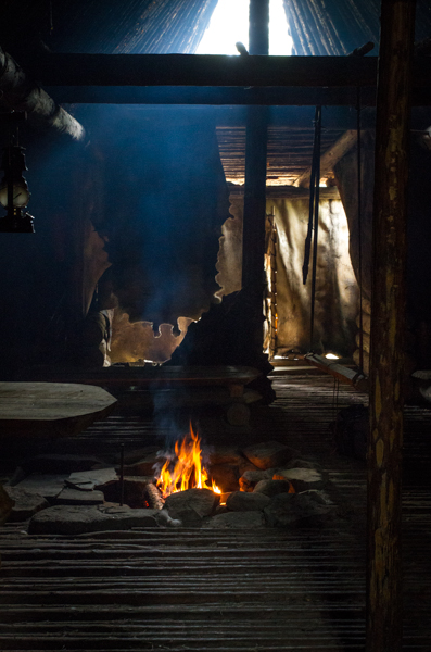
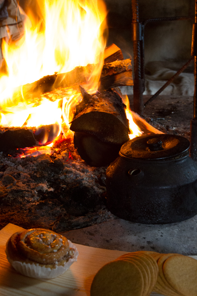
The last two pictures show different situations and spaces. The first sitting at the open fire in one og the “tipi-houses” showing how it looks while drinking coffee. The last one is shot while sitting in a more conventional building, almost like a picnic-place, looking out. An alternative might have been to sit on one of the tables that you see in the picture and looking out, being the eye of the beholder, but I decided against that as our visual field is so much wider than I can capture with a camera and with that much of the feeling of the place had gone lost.

Space and function, part three of the P&P course
4 MarSo after some time without direct contact with my blog I continue with the third part of the people and place course.
this time it is about “Space and function”.
I have interpreted as to learn how to look at spaces and try to convey the space and the function via pictures so that one, not knowing the space, can see or guess what the space is used for.
My thoughts about that are that you have to have an open eye, curious and not taking things for granted. A little like cognitive behavioural therapy means that you cannot assume things but need to ask how they are and not how they appear to be. Even Kierkegaard should be taken into consideration as you cannot assume that the beholder knows the same things as you and by that you have take him or her from the level they are on and lead them on. Otherwise you are just a show off.
Om jag vill föra en människa mot ett bestämt mål måste jag först finna honom där han är och börja just där. Den som inte kan det lurar sig själv när hon tror att hon kan hjälpa andra. För att hjälpa någon måste jag visserligen förstå mer än vad han gör, men först och främst förstå det han förstår. Om jag inte kan det, så hjälper det inte att jag kan och vet mycket mer. Vill jag ändå visa hur mycket jag kan, så beror det på att jag är fåfäng och högmodig och egentligen vill bli beundrad av den andre istället för att hjälpa honom.” – Sören Kirkegaard, Dansk Filosof 1813-1855
I guess that with most spaces it is obvious what their function is when looking at them. Either by the way they are build or by the things that are in those spaces.
Down here you have a few pictures I took while exploring possibilities of different conference centres. As you can see are the places quite exotic by western standard. It is a very simple “down to earth” place, without any electricity and just the basic accessories.
The first house has basically just two floors with beds on either one of them. I took first a picture of the whole house to give impression of the building ad size and then from the inside. I thought about taking a picture of the staircase but that did not really give any more valuable information. I wider lens would have been nice but I do not have one.
view from the outside
First floor
The second building is more or less build like a big tipi, in other words round and with a fireplace in the middle. Sitting facilities or beds on the side.
The last building is an old farmhouse and as half of it was not in use and not renovated I concentrated on the kitchen and dining area. I probably should have used more pictures to even show details of the room to give a better impression of how it looks and feels inside there but I wanted to minimize it.
